INTRODUCTION
HATASU is a modern direct-to-consumer noodle brand built around bold Asian flavors, emotional comfort and a more design-forward take on instant noodles.
For this project, I explored how a noodle brand could feel premium, expressive and culturally inspired within India's highly saturated instant noodle market.
The boxed format, bold color system and global flavor inspiration were designed to appeal to urban Gen Z and millennials who discover products visually and want convenience without giving up personality.
BRAND OBJECTIVE
Proud + Loud Flavours of Asia
HATASU (果たす) is a Japanese verb meaning “to fulfill” or “to accomplish.” The name reflects fulfillment of hunger, achievement of flavor, and the emotional satisfaction of comfort food done right. It positions the brand as intentional, flavor-first and emotionally resonant — not just a snack, but a soulful experience.
The logo and packaging celebrate Japanese heritage with a modern twist — intricate noodle illustrations and a fresh take on tradition, embodying achievement, realization and culinary delight in every savory slurp.
INDUSTRY + OPPORTUNITY
The project was positioned within India's saturated instant noodle market.
Existing brands tend toward
- Mass-market appeal
- Familiar flavors
- Convenience
- Highly recognizable packaging
HATASU explores a more
- Premium
- Emotionally resonant
- Design-forward
- Visually expressive
TARGET AUDIENCE
Urban Gen Z + Millennials 18–35
Young professionals, students and vibe-driven shoppers who eat with their eyes first — drawn to packaging that pops off the shelf and feels as fun as the food inside. They care about what goes into their meals, often leaning health-conscious, but never at the cost of taste. For them, food isn't just fuel — it's an experience, a mood-lifter, a memory trigger.
COMPETITIVE ANALYSIS
CHING'S
A mass-market Indian-Chinese brand known for its spicy, street-style flavors and wide retail availability.
MASTERCHOW
A premium-ready sauce and noodle brand focused on clean labels and urban appeal with minimalist design.
MAMA
A Thai-origin instant noodle brand popular for its authentic Southeast Asian flavors at an accessible price.
Against these, HATASU carves its own space: premium yet accessible, rooted in regional authenticity, and built to stand out visually first.
USP
Brand USP
Proud + Loud Flavours of Asia
Regional Authenticity in Every Bite
Hyper-regional recipes like Lemongrass or Hot Sesame Oil stay true to regional culinary identities — an authentic experience, not a factory-standard taste. It builds emotional and cultural richness.
Packaging USP
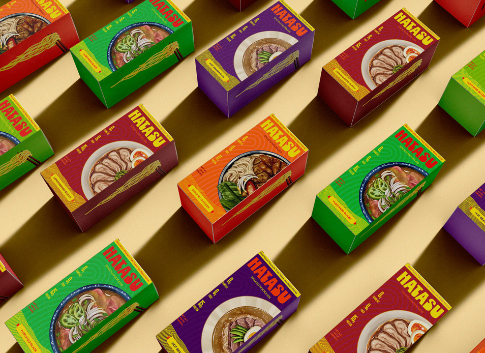
Bright, saturated colors combined with strong type and a prominent noodle visual make it impossible to ignore on shelves or in online carousels — comfort food meets pop art, appealing to visual-first Gen Z and millennials who shop with their eyes and emotions.
LOGO EXPLORATION
The wordmark was manually created to give it a personal, handcrafted feel.
HATASU
Final wordmark
01 — Explore
Multiple wordmark variations sketched and refined by hand before settling on a direction.
02 — Craft
Letterforms drawn manually rather than typed, so the logo carries a personal, handcrafted quality.
03 — Finalise
The final mark pairs the bold wordmark with noodle illustration and flavour colour coding.
MOODBOARD
The visual mood behind the brand — playful typography, energetic colours and Japanese heritage with a modern twist.
TYPOGRAPHY + COLOUR
A bold, modern style with a vibrant palette — red, orange and yellow as core tones, supported by unique colours for each flavour.
Typeface — Gopher
Aa
Regular · Medium · Bold · Black — clean, friendly and contemporary.
Core Colours
Charcoal
#313131
Vermilion
#FF571D
Silver
#BDBDBD
PACKAGING SYSTEM
Four flavours, one recognizable system — strong typography, vibrant colour and noodle illustration working together across every variant.
Each flavour carries its own colour while keeping the boxed structure, typography and illustration style constant — so the system reads as one family on a shelf, with front, back and side panels all designed.
PROJECT TAKEAWAY
“HATASU allowed me to explore how typography, color, illustration, packaging structure and brand positioning can work together to create a recognizable product experience.”
Next Project
02BELLEVUE