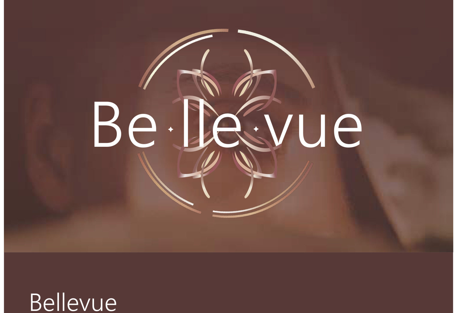
BRAND OBJECTIVE
Bellevue is a beauty brand built on celebrating natural beauty — elegant aesthetics and thoughtful design that empower women and amplify their unique identities.
The work focuses on elevating brand identities and enhancing consumer experiences for beauty companies — blending creativity with conscientiousness.
The goal: visuals that resonate with consumers, inspire confidence, and promote a harmonious relationship between beauty, nature and sustainability.
INDUSTRY / CONTEXT
Our Discipline
Helping a beauty brand's vision become reality — creating or launching a fresh brand identity, modern visual communication, and packaging design across branding, identity, social media creatives and packaging.
BRAND POSITIONING
“From the rich tones reminiscent of earthy landscapes to the soft, delicate shades evoking blooming flowers, each color reflects the beauty and harmony found in the natural world.”
Combined with warmth, tranquility and subtle elegance, the palette captures Bellevue's commitment to timeless sophistication and the outdoors.
TARGET AUDIENCE
Women mid/late 20s — late 30s
Beauty consumers looking for brand identities that feel natural, elegant and genuinely theirs.
VISUAL DIRECTION
The logo was meticulously crafted to embody the essence of nature and beauty.
The Mark
Vector graphics that elegantly resemble the delicate petals of a flower intertwined with the graceful wings of a butterfly — symbolizing transformation and natural beauty in harmony.
The Feeling
Gentle curves, clean lines and a welcoming charm — approachable luxury rooted in the natural world.
MOODBOARD
The visual mood behind the brand — grounded, blooming and calm.
LOGO EXPLORATION
The identity was built as a family — a primary mark for full applications, a secondary lockup for compact spaces, a favicon, and standalone wordmarks that hold up on both dark and light backgrounds.
TYPOGRAPHY
Leelawadee UI — chosen to strike a balance between warmth and sophistication.
Aa
Leelawadee UI — Semilight · Regular · Bold
Gentle curves and clean lines exude a welcoming charm while maintaining elegance, reflecting the brand's commitment to timeless beauty and approachable luxury.
COLOUR PALETTE
Congo Brown
#583937
Ecru White
#F0EADC
Old Rose
#C6997F
Ebb
#E6DDDA
Leather
#A36858
Au Chico
#9B5A5D
PACKAGING SYSTEM
A cohesive earthy system — the palette, logo family and typography carried consistently across packaging.
Palette-led
Every pack leans on the earthy colour system so ranges read as one family.
Mark-led
The petal-butterfly mark anchors each application with quiet consistency.
Type-led
Leelawadee UI keeps labels warm, legible and elegant at every size.
FINAL APPLICATIONS
The identity extended across social media creatives and brand touchpoints — one voice, one palette, one system.
PROJECT TAKEAWAY
“Bellevue was a study in restraint — an earthy palette, delicate marks and calm layouts working together as one quiet, natural identity.”
Next Project
03EBOOK